When Spring Bay Distillery appointed Cheval Rouge in January 2024, the initial brief was focused: bring greater clarity and consistency to the hierarchy of its whisky portfolio.
What began as a range architecture project quickly revealed a bigger opportunity. Over time, Spring Bay had grown organically, with new product releases and packaging introduced at different stages of the business growth.
Cheval Rouge identified the need to bring these elements together under one distinctive and scalable brand system, capable of better reflecting the quality of the spirits and supporting the distillery’s next phase of growth. We led the transformation from strategy through to execution: defining the brand architecture and positioning, sourcing and managing the creative agency, overseeing the identity and packaging development, sourcing and negotiating with packaging suppliers, and managing production through to final delivery.
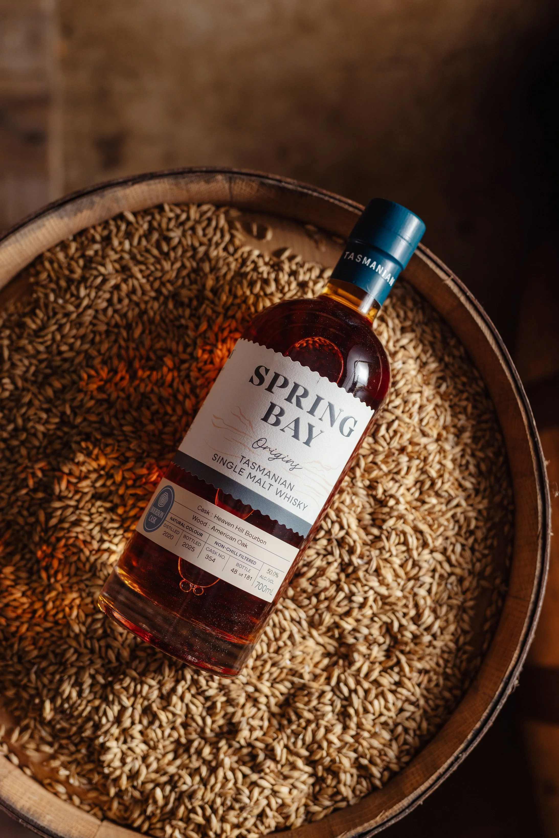
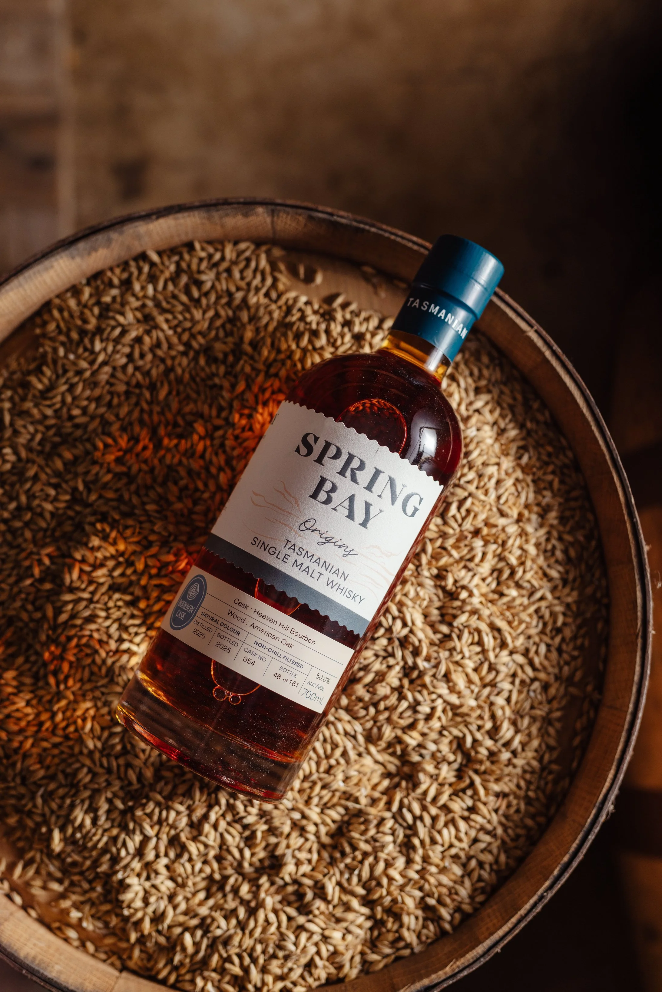
The result was a complete brand and packaging refresh, including a refined logo, new typography and colour system, consistent naming and product hierarchy, redesigned labels across the portfolio, a new custom bottle, new closures and secondary packaging, comprehensive brand guidelines and a special 10th Anniversary release. The entire portfolio was delivered in time to mark one of Spring Bay’s most important milestones to date: Ten years of distilling.
CONTEXT
Founded in 2015 by Cam and Suzy Brett, Spring Bay Distillery grew from the couple’s shared passion for whisky and more than two decades of planning and dreaming. It became the 12th licensed distillery in Tasmania and has since developed into an award-winning producer of single malt whisky and fine spirits.
Its identity is intrinsically connected to place. Spring Bay’s original distillery sits on Tasmania’s east coast, where the maritime environment and rainwater influenced by the sea form an important part of the brand’s story and the character of its spirits.
Today, the business operates across two Tasmanian locations: its original coastal Spring Beach site and a grain-to-glass whisky distillery and cellar door in Cambridge, near Hobart.
By 2024, Spring Bay had built the foundations of a respected craft spirits business. The next challenge was ensuring its brand presentation carried the same confidence, provenance and quality as the liquid inside the bottle.
PROBLEM
As Spring Bay’s portfolio had expanded, its visual identity had evolved product by product rather than as one connected system.
Different generations of labels sat alongside one another. Bottle formats varied. Naming conventions and product hierarchy were inconsistent, while the visual distinction between core, premium and limited-release whiskies did not always correspond with their positioning or price.
Individually, many elements worked. Collectively, the range lacked a clear visual language.
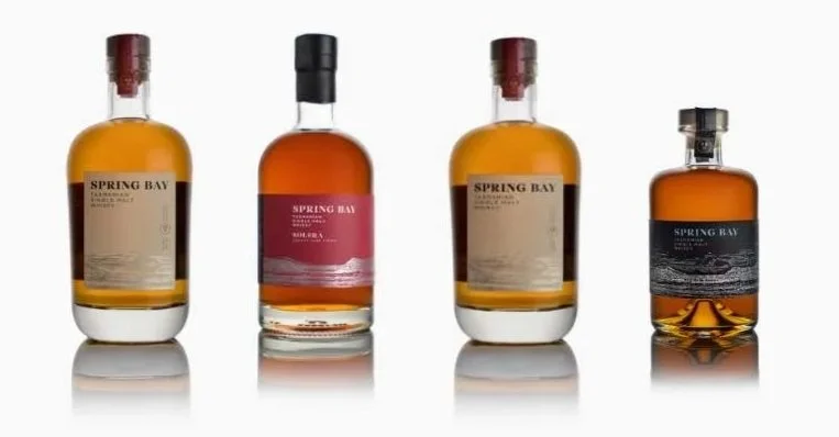
This presented a broader commercial challenge: how could Spring Bay build recognition as one master brand while still giving each whisky, cask type and price tier its own identity?
The solution needed to do more than redesign individual packs. It needed to create a brand system capable of growing with the distillery.
STRATEGY
Cheval Rouge began by stepping back from individual products and defining the architecture of the entire portfolio.
The first priority was consistency. Whisky families would follow a common naming structure and a shared label architecture, creating an immediate connection between products while establishing a clearer hierarchy of information.
Colour became a navigation tool. Rather than allowing every expression to develop its own visual language, a structured palette was introduced to distinguish cask styles and product families while maintaining a recognisable Spring Bay master identity. The final system uses Deep Teal, Freshwater Blue and White as core brand colours, supported by a secondary palette inspired by the Spring Bay landscape and specific colours assigned to different whisky styles.
Packaging architecture followed the same principle. Core products would share a consistent bottle format, while greater freedom could be reserved for limited releases and ultra-premium expressions. Closures, overcaps and secondary packaging became additional tools for communicating value and differentiating tiers without fragmenting the brand.
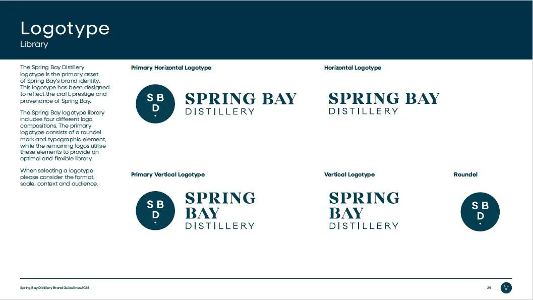
At the same time, Cheval Rouge led a wider reconsideration of the Spring Bay identity. The logo was refined to feel stronger and more contemporary while reinforcing craft, prestige and provenance, supported by a flexible system of horizontal, vertical and roundel applications.
A new typography system created clearer hierarchy across both packaging and communications, combining Neulis Sans with a secondary script typeface that introduces a more artisanal expression of the brand.Crucially, Cheval Rouge treated the project as a brand transformation rather than a label redesign.
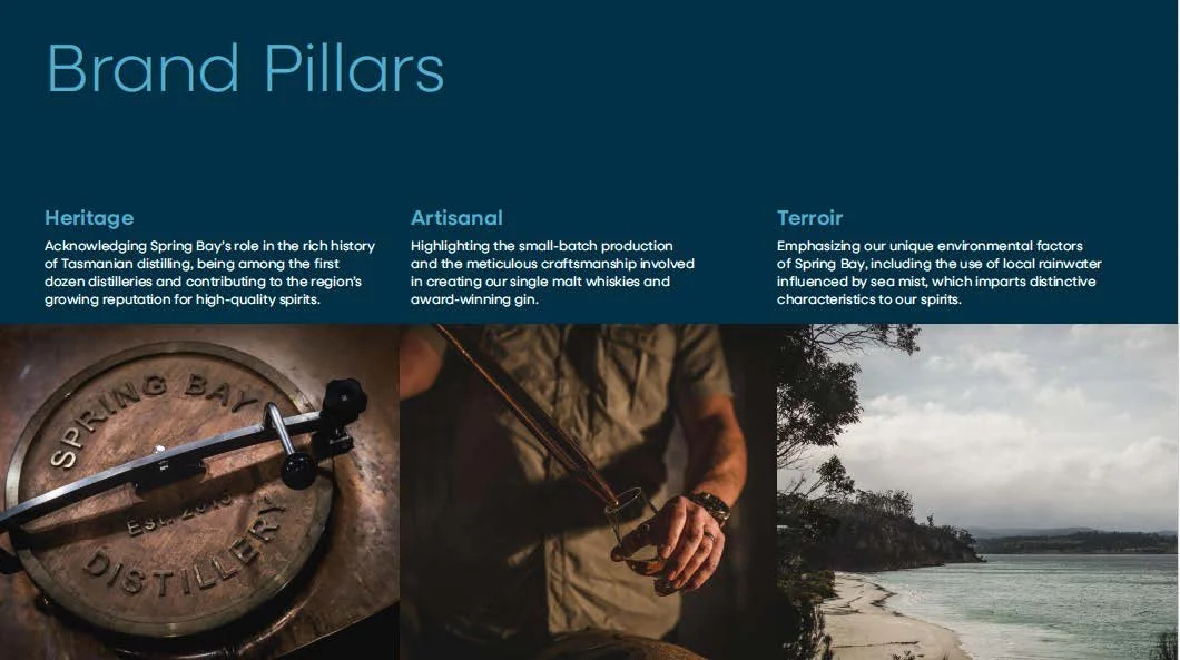
The strategic work defined the brand's broader positioning around its Tasmanian provenance, craftsmanship and founders' story. Heritage, Artisanal and Terroir became central brand pillars, creating a framework that could inform not only packaging but future communications, content and customer experience.
Cheval Rouge then managed the project end-to-end: sourcing and pitching creative partners, translating the strategy into a creative brief, managing design development and stakeholder feedback, sourcing packaging components and suppliers, negotiating commercial terms and coordinating the multiple production streams required to bring the new range to market.
The resulting system was designed to extend beyond the bottle—across the website, social media, presentations, price lists, trade marketing materials and every other internal and external brand touchpoint.
RESULTS
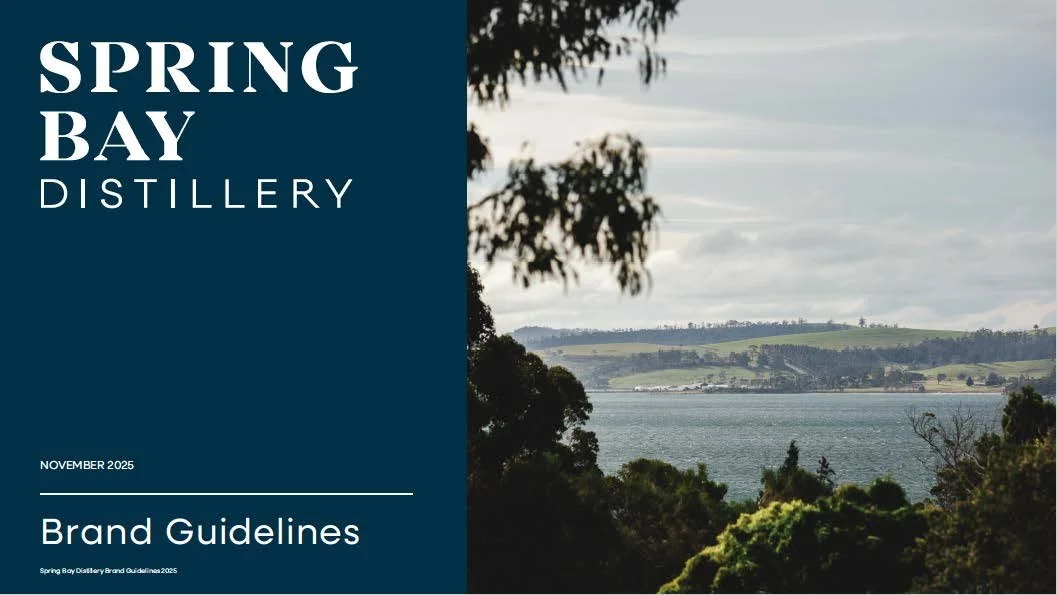
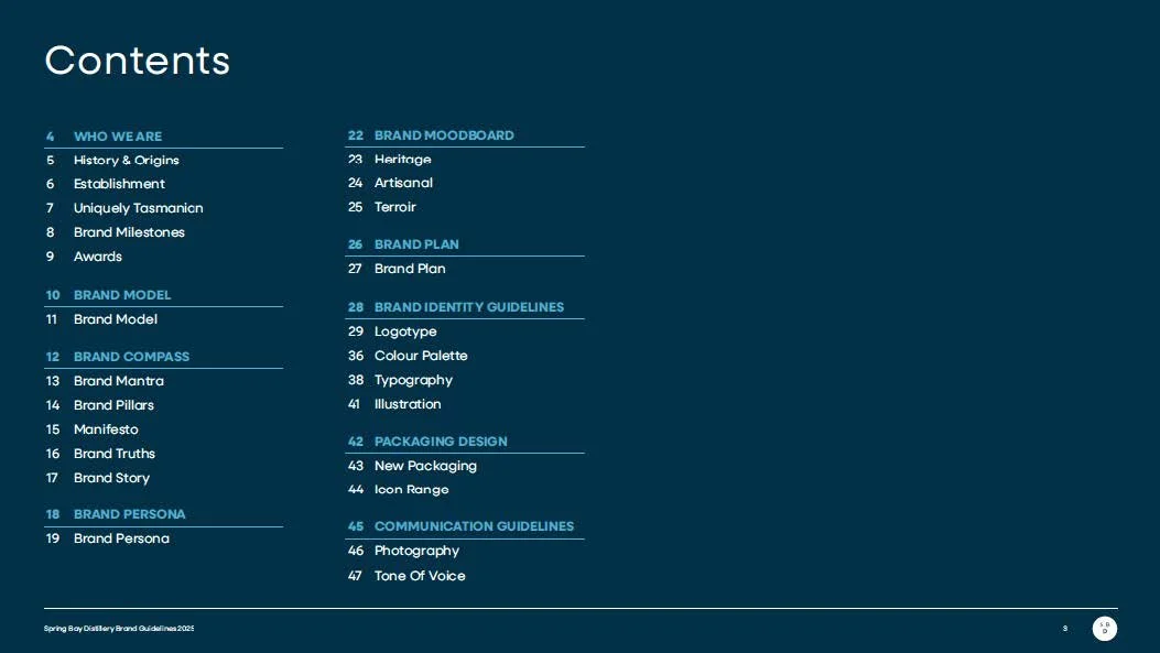
The final brand system provides Spring Bay with a consistent foundation across identity, packaging and communications. The guidelines establish a unified logotype system, typography, primary and secondary colour palettes, illustration style, photography and tone of voice, giving the business a framework it can apply consistently as it grows.
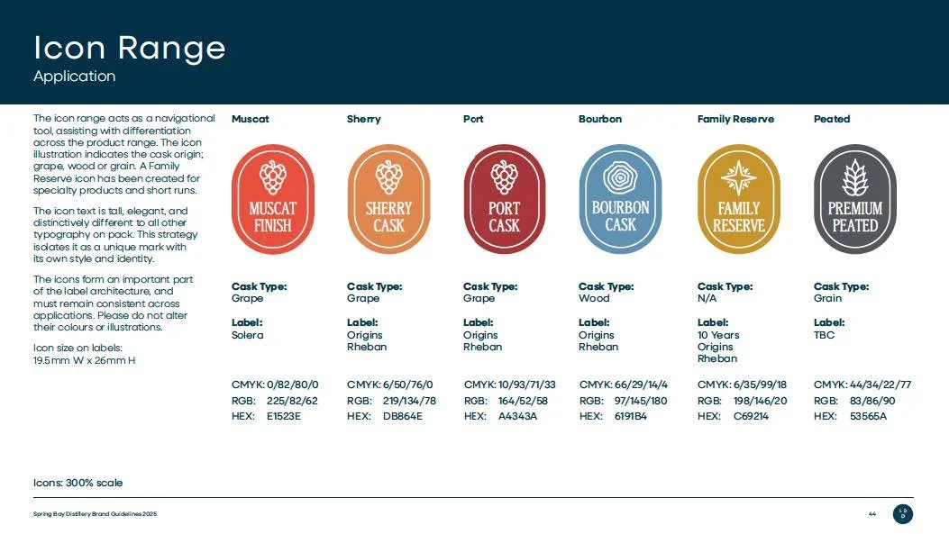
On pack, a new icon system provides an additional layer of navigation, identifying cask origins and distinguishing expressions while remaining part of one consistent label architecture. A dedicated Family Reserve treatment was also developed for specialty and short-run releases.The new bottle and packaging bring greater confidence and shelf presence to the range, while the Spring Bay landscape itself has been translated into an illustration device that adds depth and a stronger sense of place to the labels.
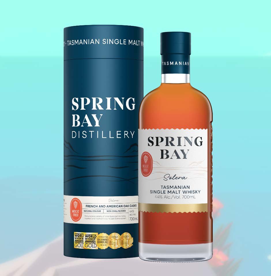
The culmination of the project was Spring Bay's 10th Anniversary Release, which became the first expression to showcase the new brand direction.
A dedicated anniversary identity and specialised logotype were created for the milestone. The release featured an exceptional seven-year-old single malt matured exclusively in a rare Château Latour Bordeaux cask gifted to Cam and Suzy. A portion was bottled for the anniversary and presented in a custom-made oak box, while the remaining whisky continues its maturation towards 2028.More than a celebratory release, it became the bridge between Spring Bay's first decade and its next.
Cheval Rouge delivered the rebranded portfolio in time for the anniversary launch, giving Spring Bay not simply a new look, but a clearer and more cohesive brand architecture designed to support future products, premiumisation and growth.
“The Cheval Rouge team did a fantastic job guiding us through the development of our new Spring Bay packaging. From the outset she was highly competent, thoughtful and incredibly proactive, particularly when it came to navigating the inevitable complexities that arise during a design process.
Their ability to combine creative thinking with practical problem-solving made a real difference to the Spring Bay project. They anticipated challenges early, communicated clearly throughout and consistently brought smart, practical solutions to the table.
Working with Cheval Rouge was both easy and productive, and the fi nal result refl ects their professionalism, attention to detail and strong understanding of brand presentation. I would highly recommend them to anyone looking for a talented designer who takes genuine ownership of a project and delivers outstanding outcomes.”
For any questions about this project or Marketing inquiries, please contact:
Alex Tomasi - Head of Marketing
e: alex@chevalrouge.com.au
p: +61 401 847 060